Last year Libery Media took over Formula 1, and this year they've started making their mark. Whilst I could discuss the running of the sport in detail, that'll be done better elsewhere, so I'll be sticking to what I know by exploring some of the new graphics, and how a holistic designer should be considering common video encodings. There's a bonus at the end with my thoughts on the new typeface and theme tune.
I nearly split this post up, but felt as it is there's something for everyone.
The Halo Graphic
The halo has been a contraversial introduction. For a background, see any set of comments on any F1 YouTube video. Something good, in my view, that has come out of it is the heads-up display style graphic they sometimes show in the onboard shots.
The graphic sits around the halo and shows live data for speed, current gear, throttle pressue/position, brake pressure/position and RMP, giving the viewer a better feeling of what the driver is doing. I expect this would have been great to see back in Senna's time, where he was known to pulse the throttle during cornering to keep the turbo spooled up (for reference, this didn't work for me in a Smart Roadster).
I like the aesthetics of the graphic - like all cool UIs they could sit well in Minority Report, and they wouldn't look out of place in the
Marvel films. The blue glow and transparent backgrounds are what every young boy wants in front of him in his imaginary race car/space ship/town planning meeting.
The aesthetics are significantly different from the info graphics, which keeps this graphic planted in the video itself, closely coupled to the car it's wrapped around. However, the use of the F1 typeface gives enough branding throughout the screen to maintain cohesion.
On a less positive note, the graphic is
big, taking up over half the height of the screen. Although I think it mostly avoids anywhere else you might be looking, such as tyres, steering wheel or corner apexes, it can be hard to look anywhere but the graphic, with the speed posted front and centre.
On a similar note, there's a lot of data to digest. Although it looks great, I can't actually take in much of the data - it takes a conscious choice to decide if the brake/throttle, speed/gear or RPM are what I want to be tracking. I think many car manufacturers have managed this better, with examples including concentric speedometers/tachometers and acceleration/braking/chargeing indicators on hydrids such as the Toyota Prius.
Whether you like the halo or not, I think this makes the most of it. It also hides the halo itself, which likely makes many people happier. Saying that, it may also serve as a reminder that the halo is there, which may just lead to more anger.
The Race Info Graphics
The new race graphics, on the whole, look pretty nice. They fit well with F1's new brand image, and tend to convey data fairly well. They're not always perfect, but I prefer them to the graphics of previous years.
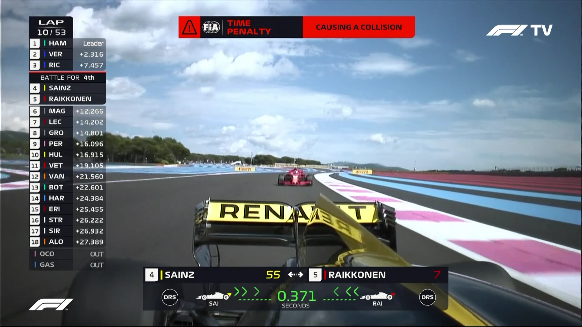
One part I particularly like is the gap graphic, showing the time between two cars. For those not familiar with the races, once that gap gets below two seconds, things start to get interesting as there's a chance they might get close enough to affect an overtake. Below one second they will get DRS, an overtaking aid that increases straight-line speed by reducing drag. Below half a second they actually have a chance of making a pass and, of course, at zero they're making the pass itself.
I tend to keep an eye on these gaps as, until they get low, there's not always much else to look at. One of the new boxes at the bottom shows the live gap between the cars, and how it is changing. Green means it's getting smaller, which is good for the car behind and any viewers who want to see an overtake. Yellow means it's getting bigger, which is bad for the car behind, and any fans of that driver. Arrows animate inwards to symbolise this change in gap, making the whole ensemble quite effective - probably more so than the aerodynamic rules are in allowing the actual overtake to happen!
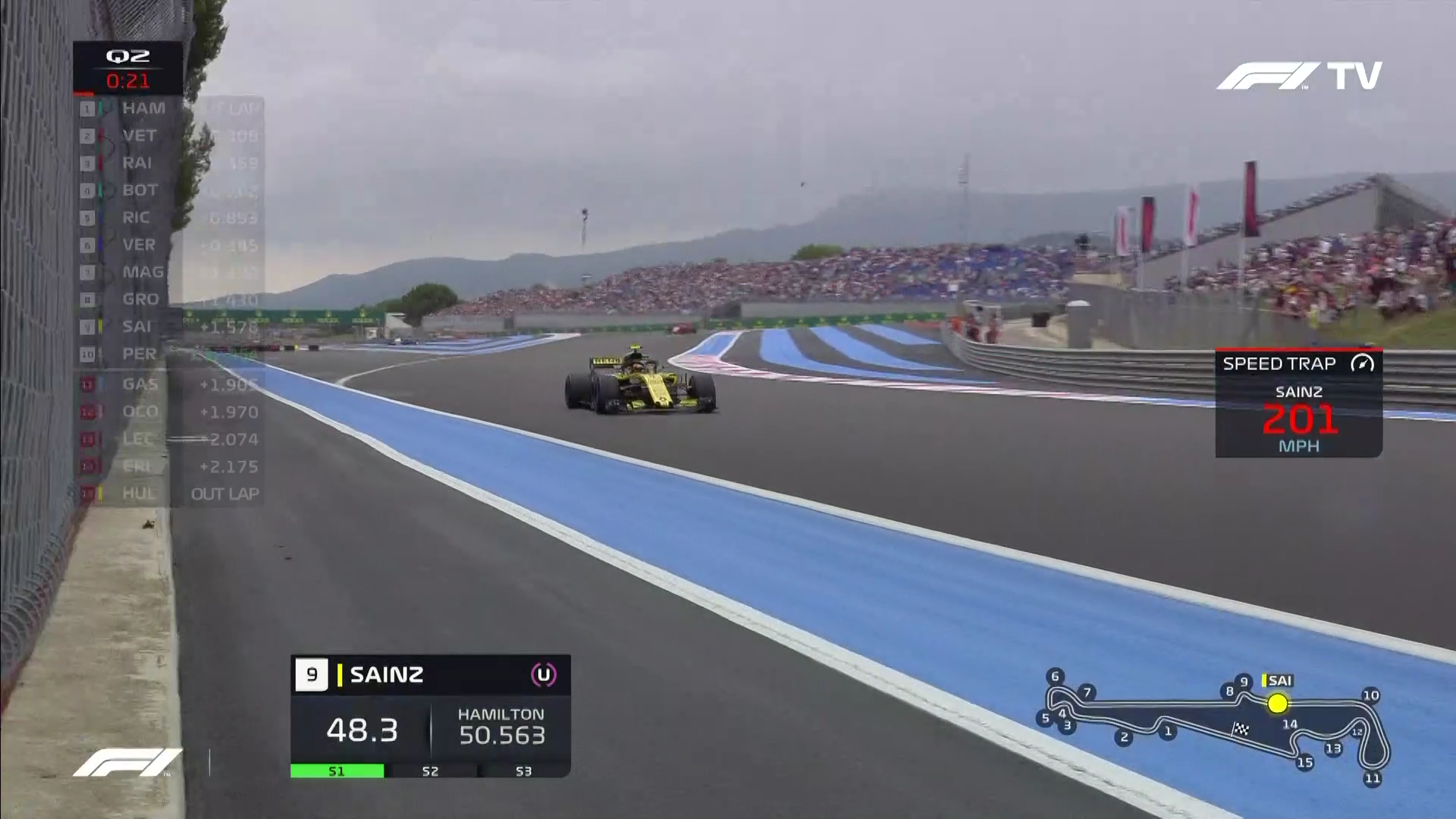
Another nice touch is the lap time graphics for qualifying. Qualifying is about getting a good time around a single lap of the circuit. In the first two sessions, the aim is to get a time faster than the slowest five cars. In the final session, the aim is to get the fastest time. This all comes to a crux in the minutes just before and after the chequered flag is waved in each session, where several cars will be on hot laps, trying to beat someone else's time.
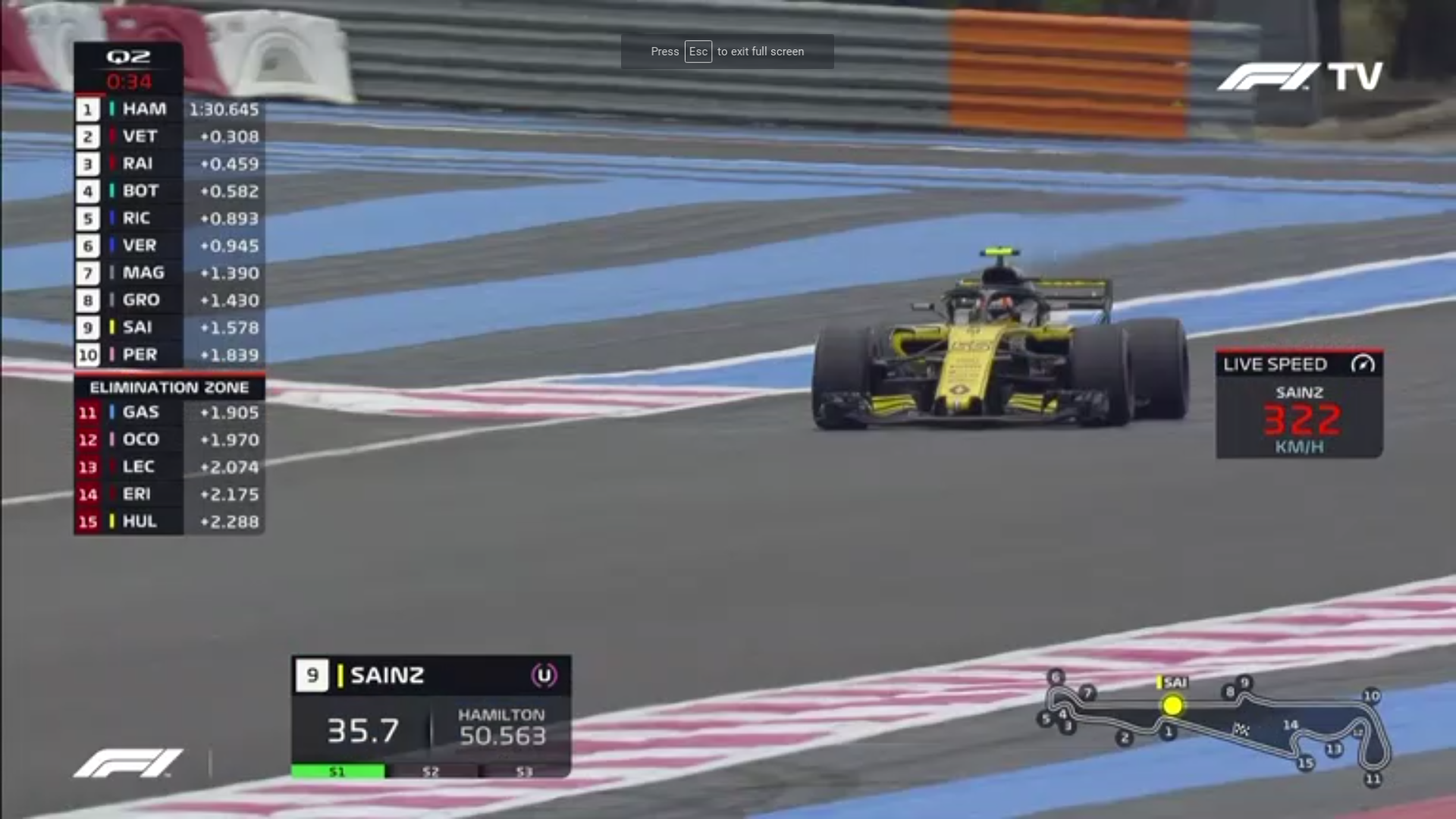
A box for each driver of interest, up to a maximum of three, will show along the bottom of the screen, with their current time displayed, along with the time they're trying to beat. Their three sectors are also shown, as either slower (yellow), personal best (green) or fastest of everyone (purple), once they complete each of the three sectors, which gives an idea if they have a chance of making it through.
In the example above, Carlos Sainz improved his time in sector one, and is coming toward the end of sector two. At the sector two marker, Hamilton had a time of 50.563 s, which Sainz would ideally beat. A better example, which I didn't manage to screenshot, would be when they show one of the cars ranked between 11th and 15th next to Perez' time, in 10th position - if they can beat this time then Perez will be knocked out of qualifying by the respective driver.
Video Encoding and Holistic Design
It's a graphic designer's job to consider how their work will work in every relevant situation, to think holistically Nice as these graphics look, I've noticed some flaws with the design, that show the designer didn't get it quite right. In fairness, I'm not sure I'd've noticed this either at the design stage, and the designer may've been hamstrung by a set of brand guidelines.
The graphics mostly use white on black/grey, with what I expect is called "FOM red" as an accent colour - quite a heavily used accent colour. As my former collegues will attest, I think white/red on black/grey looks pretty nice and is, of course, the correct way to go if it matches the brand. It would look out of place if FOM were using red in their print/web media and then used aqua as a highlight on their TV feed. However, I'm not sure
this red was well chosen.
Is this a bold claim, can one red be any better than another? I think, when you take into account how this media is distributed, yes is the answer. A lot of video is now distributed by streaming over the internet. The nature of steaming means it needs to be tolerant to the bandwidth available which is usually accomplished by using some form of adaptive bitrate streaming. I happen to have discussed this back in 2013, so head
here for more information on this, but the essence is that if your connection handle a high-bitrate stream (think HD) your stream will drop to a lower-bitrate stream (think SD or that really blocky/fuzzy video you get trying to watch YouTube on 3G.
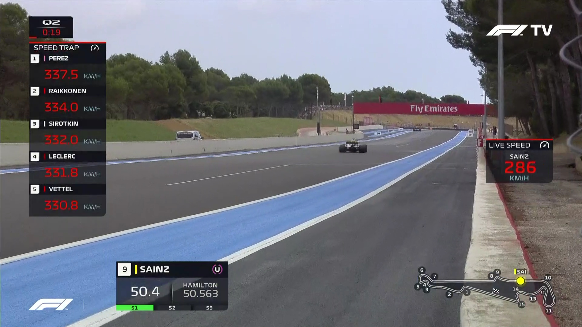
The above example, with the speed trap graphic, being sent to me at a fairly high bitrate. The video itself looks decent, and the white text looks crisp. The example below, with a leaderboard graphic, is being sent whilst the stream was stabilising, so is at a much lower bitrate. The video is less detailed, and the white text looks a little blocky.
Now take a look at the red text in each photo. Even in the high bitrate image, the red text looks a little fuzzy. In the low bitrate screenshot it's hard to even make out the "0:34" time remaining. This also happens to Sauber and Red Bull's team colour bars (positions 5, 6, 13 & 14), which are less bar-shaped and more just bloches of probably-not-black. The teal of Mercedes (positions 1 & 4) and yellow of Renault (positions 9 & 15) are still quite sharp.
This blurryness is due to the way the video is encoded, before being sent down the wire to my computer. As you'll know if you've ever compared the size of a photo saved as a bitmap to one saved as a JPEG, uncompressed images take up a lot of space, which is why we tend to use JPEG compression for our photos. A video, being lots of photos in a sequence,
really needs compression. This compression is achieved in several ways, and involves making several trade-offs, reducing detail you won't notice in the first order, and detail you will if more compression is needed. In the case of F1TV, and likely most other streams, the encoding chosen is H.264. The part we're interested in here is "chroma subsampling".
For the sake of this discussion, we'll assume a video is sent frame-by-frame, as a grid of pixels. In fact, further bandwidth savings are made by tricks such as only sending what's changed or moved between frames, and transforming the pixel grid into more efficient formats with a method similar to the Discreet Cosine Transform.
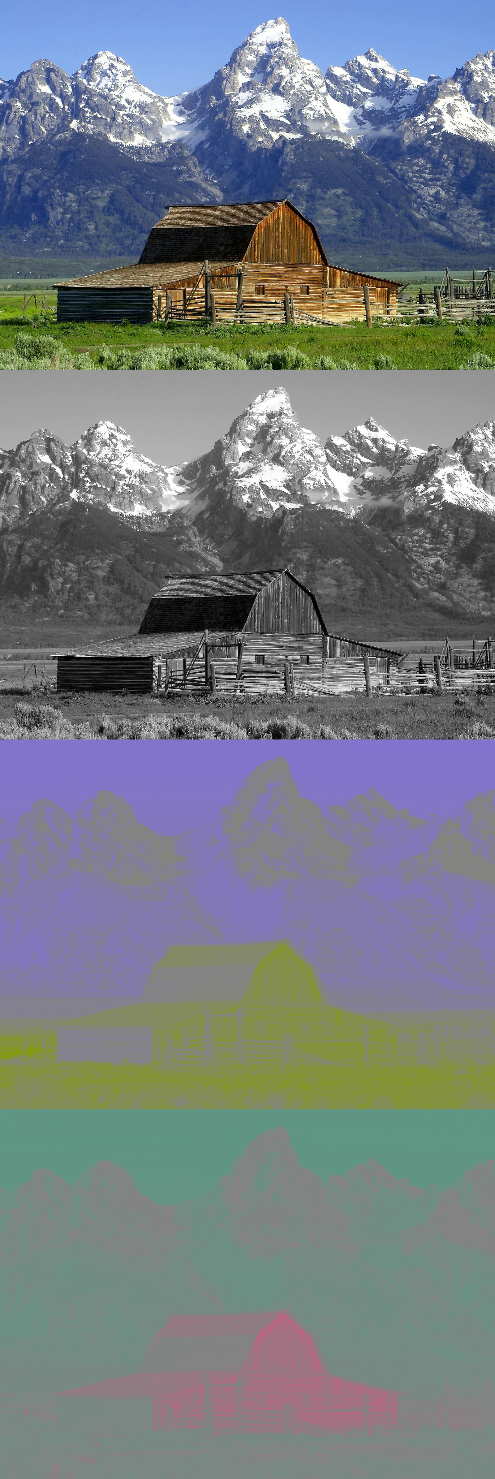
We might be used to this grid of pixels being stored with each pixel having a red, green and blue component and this is, roughly, how the camera's sensor will capture the image. This is almost certainly how your screen will display this image to you. However, the image can be transmitted in a more efficient way, called YCbCr.
YCbCr encodes each pixel as a "luma" value (how bright the pixel is) and two "chrominance" values (these are a little harder to explain, but a very roughly whether the pixel is more bluey or yellowey and whether it's more reddy or cyany). The image above shows a source image, followed by its Y, Cb and Cr components. At this point, we still haven't saved any data.
The human vision system is much more sensitive to changes in brightness than colour. This means if we send less chrominance data then we do luma, it doesn't really get noticed when they're put back together. This is one of the way's JPEGs save data too - if you click the image above to see the full-size version, you'll notice the chrominance channels are much more blurry than the luma. To achieve this in the video encoding, we "subsample" the chrominance components.
We effectively take our three channels for the frame as three separate images. We send through the luma channel as it is. The two chrominance channels we resize so they're half the width and half the height, meaning they now take a quarter of the bandwidth to send. When the video gets decoded at the other end, they're scaled back up, and usually, no-one notices the little trick we played on their eyes. This subsampling can be done by resizing the image to varying sizes, but this ½ width, ½ height format is quite common, and is referred to as 4:2:0 subsampling. Other types of subsampling are explained fairly well
here on Wikipedia.
For photo-like content, such as a car driving on a road, or a house in front of a mountain, the little detail in colour between one pixel and the next doesn't really show, which is why we subsambled in the first place. However, graphics like text or sharp lines aren't what this subsampling was designed for. The white text in the new Formula 1 graphics is entirely in the luma channel, so gets sent at full resulution - this is why it looks nice and crisp. The red contains very little luma, relying on a chroma channel to describe what it looks like. This means the text is effectively getting rendered at half the resulution, as it's getting subsampled. This isn't too bad when the stream is at a bitrate for an HD-like resolution, but once the bitrate gets dropped due to a poor connection, if you've got white text that's getting fuzzy, the red's going to be twice as bad. The reason Mercedes and Renault's team colour bars still look good is that those colours have a high luma, so they still keep a well-defined shape.
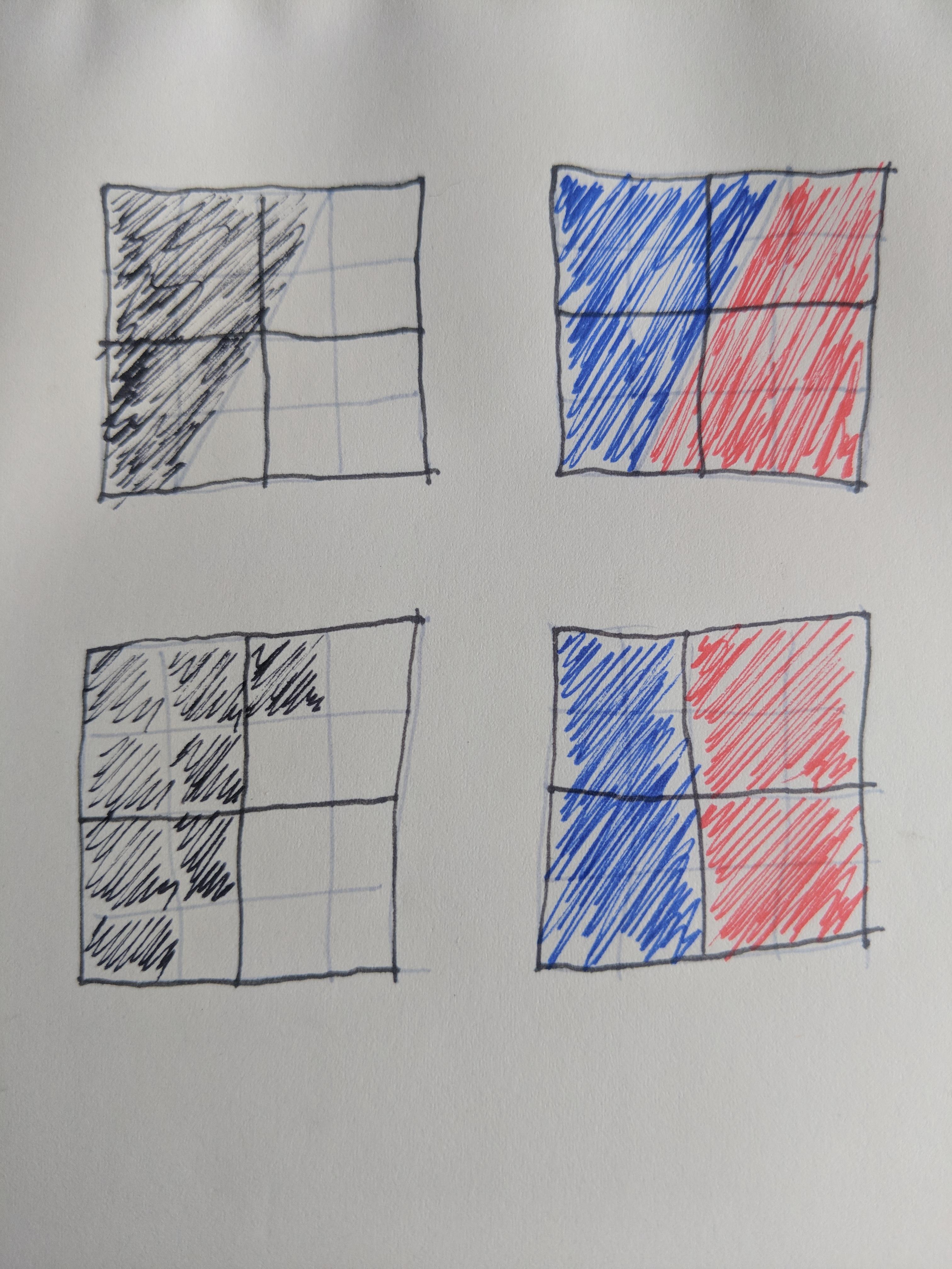
The little sketch above shows how a diagonal line might get encoded into pixels. The black/white version, representing high-luma text, is sampled at 4x4 pixels, and looks somewhat similar. The blue/red version, representing high-chroma text, is sampled at 2x2, as has clearly lost some detail. Although the drawing may be a little contrived, it demonstrates how the subsampling is loosing shape.
The solution here, unfortunately, isn't just to send the video through without the subsampling (4:4:4 as it's known) - this would require twice as much bandwidth (if we assume we're just sending our pixel grid). Had the designer thought about the transmission medium, they may've worked out their work would likely be subsampled in this way. This could've allowed them to choose a brand colour with a higher luma component - the deep red they have will have virtually no luma. A more orangy red may've been a better choice, given how much media they now distribute online. Maybe this sounds unreasonable, but I'd suggest you'd be annoyed if your designer specified a hero colour for your website that looked awful in print - the way I see it, a holistic aproach would seek to avoid such problems as far as possible.
Bonus Round: Typeface & Theme Tune
The new F1 typeface (F1 Regular, designed by Marc Rouault) looks alright - now we're eight races into the season it's fitting in quite well. The letter shapes are interesting, the shapes evoking the look of racetracks from above, and are readable-enough for the short words used in marketing and the world feed. It would be horrible for body text though, even in mixed-case - this is definitely meant for headings. He also made two alternates, F1 Turbo and F1 Torque, which work well as a family. There's a nice writeup
here, and plenty more elsewhere, so I'm not going to go into more detail.
As another part of Liberty's big spend on branding, they had Brian Tyler compose a new theme tune. As a film composer with titles like "Avengers: Age of Ultron" and "The Expendables" under his belt, it's clear they were heading for some drama here, although given he's mostly worked on sequels, I'm guessing they couldn't afford Hans Zimmer or John Williams. Bargain-basement or not, what he's produced is really good. When I first heard it I wasn't sure it would fit in too well but, having seen it in action, I think it's great, creating an excitement as the opening titles come up, dying down during the race intro from the comentator and then being played again triumphantly when the race is won and the leaderboard is shown.
It'll never break The Chain though.
The screenshots of the F1 World Feed shown in this post are © FOM and their reproduction is, I believe, a Fair Use and Fair Dealing.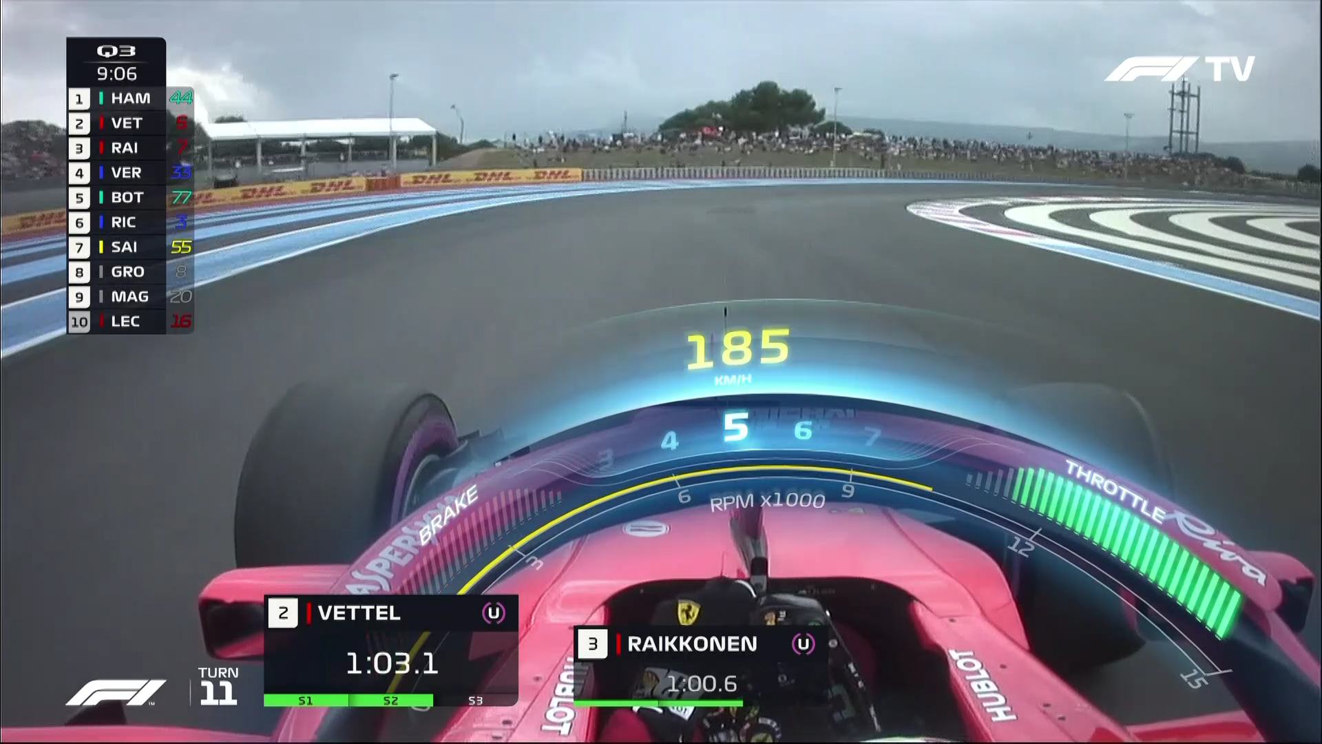